
Deck Design & Template System
Client
Capital Investment Advisors
Industry
Finance & Wealth Management
Scope
Brand Stewardship
Credits
Design & Creative Direction
Izzy Wootonn
A wealth management firm in need of visuals as polished as their services
When Ansur came to me, the ask was simple: they needed a presentation deck template that reflected their level of expertise. But I saw a deeper need: a complete visual system that would compound their credibility with every detail. Wealth management is an industry that demands a discerning eye, and Ansur rightly had a little skepticism: they’d been burned before. Could a designer really understand the nuances of financial credibility? Could we create something that felt both modern and classic, ambitious and trustworthy? The answer was yes—but only if we started from a foundation of deep understanding.


Increasing Brand Clarity through Visual Metaphor
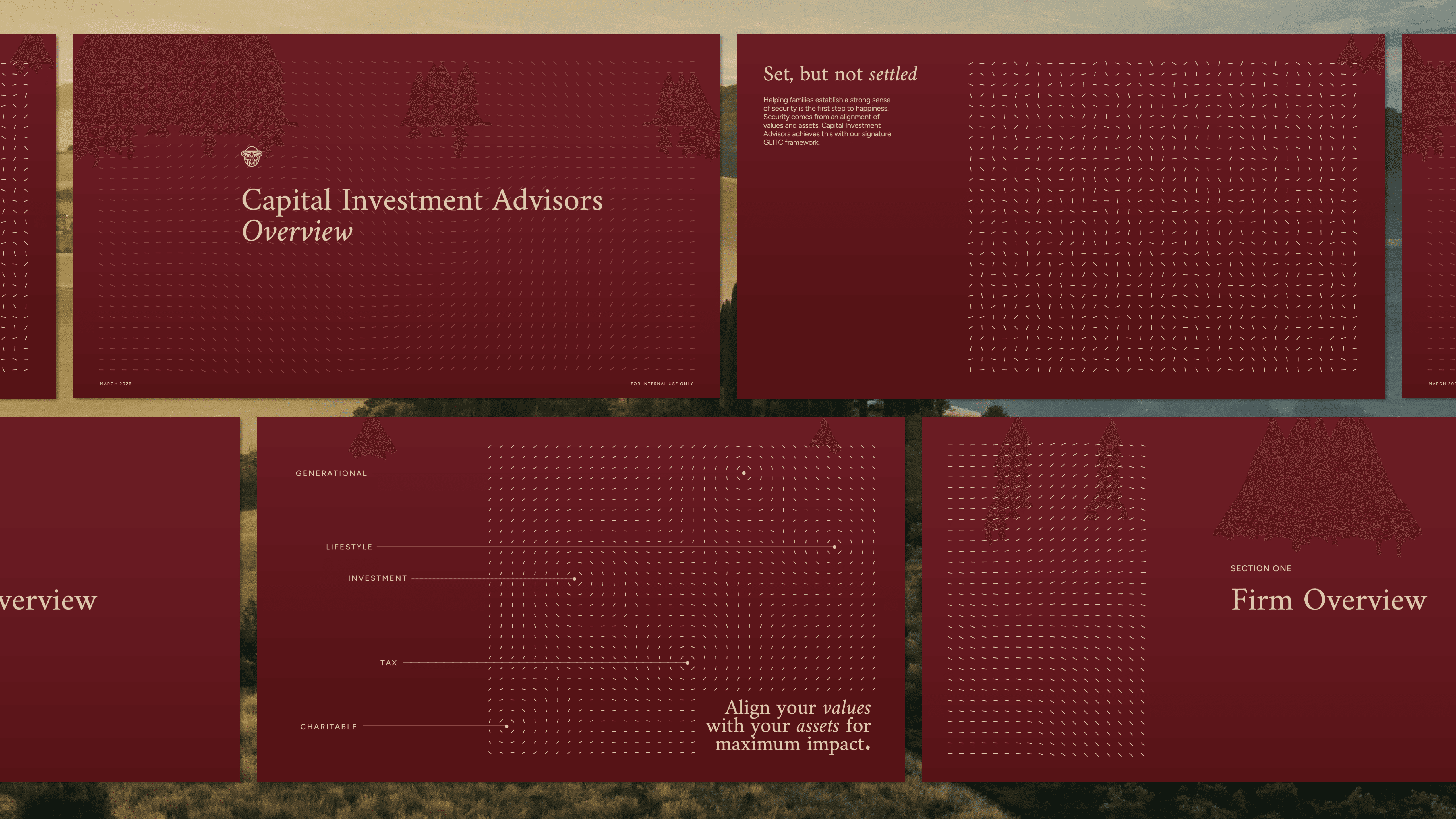
The surface problem was clear: their current materials were generic. Default fonts, layouts lacking hierarchy, and colors that didn't harmonize well. But the real problem ran deeper—CIA had a brilliant framework to explain their wealth strategies, but the diagrams required extensive explanation to land. The core concept: clients were “set” (they had the assets), but they weren’t “settled” (these assets were scattered, without a clear direction). CIA brings everything into alignment.
Immediately, I thought of a magnetic flow field—without a direction, particles scatter randomly. When a clear direction is applied, everything falls into place around it. Not only was this an elegant narrative tool, but it would serve as an excellent way to add interest to layouts without the need for cheesy stock photography. There was just one challenge to this direction: it’s a massive amount of effort to create this effect manually. So I built a custom flow field generator that can be used to create variations easily, and export scalable vector graphics for any application. (Try the flow field generator for yourself here)
With a distinct visual narrative in place, I developed 13 unique master slide layouts, plus a new typography and color system that balances a classic heritage aesthetic with modern touches.
The impact has been immediate. People are visibly impressed—the polish registers instantly, especially to clients who've seen the old deck. More importantly, the framework lands differently now. As a visual metaphor, it communicates in seconds what once took minutes to explain.


"I was worried the specific aesthetic we were going for wouldn’t be understood—wealth management is a very specific industry, and the financial sector requires a really discerning eye. But Izzy listened so well and really did a good job of probing beyond just the surface level—she took the time to understand the spirit of what we were doing. She perfectly captured what we were going for and struck that hard-to-achieve balance of being appropriate for the financial industry while looking modern, yet classic. People immediately think the new materials are so much more polished, they're visibly wowed each time. I'd give Izzy an 11/10 rating. Easy to communicate with, very sweet, high quality work, great value delivered. We're really lucky to have met her! We'll definitely be working with her more and more in the future."
— Ansur Ahmed, Capital Investment Advisors